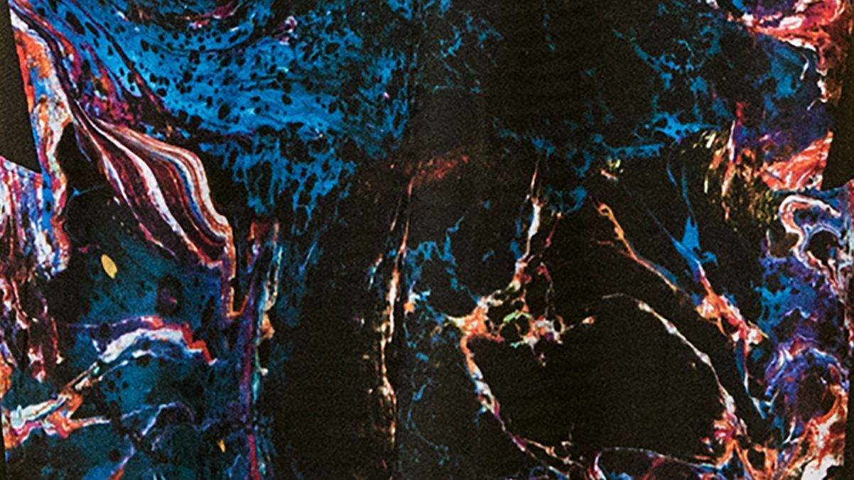
Tottenham Hotspur have released their new away kit for the 2021-22 season and it’s fair to say that while the jersey has split opinion sharply, everyone has an opinion on it.
When Spurs released the simplistic design for next season’s home kit in May, the all-white t-shirt got a mixed reception as one person’s “classic” look was another’s “ultra-bland.”
As if to redress the balance, the north London club and manufacturers Nike have made sure that the accompanying away strip could not be more different.
😍 A true 𝗰𝗹𝗮𝘀𝘀𝗶𝗰 at home.
😎 ᴜɴʀᴇᴘᴇᴀᴛᴀʙʟᴇ on the road. pic.twitter.com/kEPtqbABIQ— Tottenham Hotspur (@SpursOfficial) July 22, 2021
The shirt features a dark base which is awash with a pattern of swirling, cosmic nebulas of psychedelic colour, pitched somewhere between images of deep space and a “Grateful Dead” album cover.
The club crest and sponsors’ logos are resplendent in a jarring “Venom Green” which makes them stand out from the metagalactic pattern.
Mercifully, both the shorts and socks which complete the away kit are black. But, despite that creative concession, the kit is surely one of the most distinctive and ground-breaking that the Premier League has ever seen.
The retina-troubling print is, according to the manufacturers, deliberately “expressive” and designed to represent the collective creativity of artists and “local minds” in one of London’s most diverse areas — though no further information is offered.
As you might expect, the jersey has been met with varying levels of shock and awe on social media, with an invite from Spurs for their followers to describe it in one word drawing responses from right across the spectrum of approval.
Marmite pic.twitter.com/wv9GuVlWlZ
— It all seems a bit trivial now 💙 (@MattyFrench82) July 22, 2021
Disgusting
— Trevor Lloyd (@Trevorlloyd92) July 22, 2021
Ravey
— Amy Lauren 💙 (@djamylauren) July 22, 2021
Unnecessary
— The Spurs Show (@spursshow) July 22, 2021
Should’ve
— Specsavers (@Specsavers) July 22, 2021
Some fans poked their heads above the parapet to voice their admiration — begrudging or otherwise — for the unusual effort.
I know half Spurs Twitter hates it, but this might be in my top 3 away shirts we’ve had. Love! 🪐💥🖤 https://t.co/BCliGxhGH5
— Charlie Parrish (@charlieparrish) July 22, 2021
The new Spurs away kit is something to behold. It’s legitimately looks like that Samsung Galaxy Fortnite skin (but I don’t hate it). pic.twitter.com/OO2DvzUcDl
— Matt Brian (@m4tt) July 22, 2021
Not sure whether that was the intention but the new Spurs away kit immediately made me think of a black hole in a distant galaxy. Perhaps an apt symbol for life as a football fan. pic.twitter.com/XksG2il7kQ
— Chris Slegg (@ChrisSlegg) July 22, 2021
Spurs handed official modelling duties stars of the men’s and women’s teams including Son Heung-Min, Davinson Sanchez and Ashleigh Neville.
However, despite being front and centre for the home kit launch campaign two months ago, star Harry Kane is not present in any of the publicity shots for the away kit.
This may come as a slight concern to some Spurs supporters, as sources have told ESPN that the England captain has informed the club of his desire to leave and Premier League champions Manchester City are preparing a £100 million bid to sign him this summer.
However, Kane’s absence is more likely a result of his international involvement at Euro 2020 and his subsequent delayed summer break.
